Tag Archives: art buyers

Abide Studio
Several years ago I was at a dinner in a home in the “old money” section of Nashville. The home was beautiful and the walls were adorned with “named” artists of the area. I asked the homeowner about one of the paintings, hoping to engage in conversation. The response was on the order of “I don’t know, my decorator picked it out.” Really? Sadly there are buyers, even collectors out there that only purchase what someone else has told them to buy, or “who” someone else has told them to invest in. I call this buying with ears rather than eyes.
Within the week a friend told me that my art was all warm tones with too much red and orange and wouldn’t fit in her home. Now I know this woman’s decor and I knew that there were several pieces in my inventory at that time that would suit her style and palette beautifully. She was however stuck in the mindset that art needed to perfectly match what she narrowly defined as her “style”. We in the art world call this matching the sofa. Buying by sight, yes, but…
Shortly after these two occasions a customer came into the studio, took the time to study several pieces, engaged in a conversation with me about the stories behind the work that spoke to her heart. She selected the one that she “had to have”, purchased it, and went home delighted with her new acquisition. She represents those customers who appreciate art for its story, for its emotional value, for the workmanship and personal touch of the artist. These are people who engage with the art as well as the artist. This woman bought through the eyes of her heart. Bingo!
All bring cash to the table.
All help pay the bills.
All are buyers and even collectors.
But art should engage the buyer and subsequently the owner as they view it on their wall. It is created to be enjoyed not ignored. Those who are touched by what I have labored to create open themselves up to the transcendent power and mystery within the painting. It is my heart on that canvas. Deep calls to deep; the song of my heart is heard and received when my work is purchased by one who engages with it.
That’s my heart’s desire.
That’s my art’s desire.
Want to know more about my art? Click here to sign up for my email newsletter.
Click here to shop my original art.
If you like this post, please share it with your friends.
2 Comments | tags: abstract, art, art biz, art business, art buyers, art collecting, art lovers, buying art, collecting, original art, purchasing art | posted in Art Collecting, Being an Artist, Studio musings
I am honored to host this guest post from friend and author Teasi Cannon. Not only do I treasure her insight, I am humbled by how God used my work to speak to His awesome daughter.

What looks like three paintings on my living room wall to others is actually a tangible

representation of God’s goodness and love to me. From the moment I saw Deborah’s painting, “Wild Flowers,” I knew it needed to be in my home. In combination with “Precious Poppies” and “Water Garden,” this arrangement blesses me each and every day in ways that are hard to describe. The first time I saw them together, I actually cried, and it was hard to look at them for long for fear that I would be a blubbering mess. I think it’s because as I looked at all the beautiful colors – colors that seemed to bounce off the canvas as they reflected the sunlight coming into the room – I felt God’s immense pleasure. I felt His goodness in a way that my soul needed more than I knew. I could almost hear Him laugh with delight at my joy.
There are many colors in the paintings, but the ones that stood out to me at first were happy…light…pinks and blues and greens…colors of goodness. As one who thinks too deeply about nearly everything, these paintings are a daily reminder to me that there is beauty all around, and that God desires for me to enjoy Him along the way…to stop and smell the flowers (or admire them on my wall ).
The paintings have been on my wall for a few weeks now, but still…when I stop to look at them and really take them in, I cry. Even sitting here thinking about them I tear up. I don’t totally understand yet why I respond this way, but I’m pretty sure it’s because I’m undone by the sweetness of my Heavenly Father and His gentle, kind, beautiful love for me – and the knowing that He sees me as His sweet and worthy girl.


Teasi Cannon’s blog is a fresh look at the condition of our hearts, thoughts, and how we live life. Her authentic take on life as a real person in love with a real God is refreshing and uplifting. Her book “My Big Bottom Blessing” has changed lives across the country. From the back cover: “Loving the girl in the mirror isn’t about changing how you LOOK but allowing God to change how you SEE.” Teasi is a sought-after speaker who loves to help women remember who they are in Christ. Visit her website at www.teasicannon.com
Leave a comment | tags: abstract, acrylic painting, art, art buyers, artistic voice, God's love, inspirational, meaning of art, original art, Teasi Cannon | posted in Art Collecting, Etc., Studio musings

“Lifted Higher” 18×24
Is your art just a pretty face on a dull wall? Contrary to popular belief, whatever you put on your wall should be more than a splash of color to brighten your room. Art in whatever media and form should speak to you and your guests. More than paint or pastel, photography or pottery, art’s job is to transport. I am not suggesting that everyone’s art should look the same. Or be liked by everybody. Just as one person’s music is another person’s noise, art collections are as unique as the individual collecting them.
What I am saying is that when you buy art you are purchasing more than color, line, texture, and composition.
Visual art is a change catalyst.
Visual art changes atmospheres. A gloomy room becomes lighter and more vibrant when a painting full of bold, bright colors is added to the environment.
Visual art changes moods. One look at an uplifting painting can shift a depressed spirit to one full of hope.
Visual art transports. Look at a painting of a waterfall painted in cool tones of deep green and blue on a hot day, and suddenly the day is not as stifling.
Visual art that speaks to the heart and soul is not necessarily found in the pages of a Pottery Barn catalog or on the walls of Restoration Hardware. It’s not even found in Anthropologie or IKEA. Just because a print, poster, or piece of original art “goes with” a certain vignette featured in any of the above does not make it the right choice for you, the end user.
Want to make a difference in your own life? Pick wall jewelry that uplifts, transports, and inspires you. What you spend matters not. A $5.00 note card that makes you smile is as valuable as a $5000 painting that does the same.
Want to make a difference in your life? Make a difference in your art. You will thank me in the end.
Leave a comment | tags: Anthropologie, art, art business, art buyers, art collecting, art investment, art lovers, changing atmospheres, collectibles, collecting, IKEA, inspirational art, original art, Pottery Barn, Restoration Hardware | posted in Art Collecting, Etc., Studio musings
I love color. Shades and hues. Values and tints. Intensity. Saturation. This is the vocabulary of my artistic soul. Light. Energy. Prisms. Pigment. This is the vocabulary of my scientific soul. Advancing or diminishing. Highlights or Low lights. Complimentary, Analogous, Triad . This is the vocabulary of my theoretical soul.
One can often hear viewers exclaim “You’re not afraid of color are you?” as they pass my display at an art festival. Should I be? No one told me! That comment always intrigues me: fear of color? Never! I embrace it. Experiment with it. Am emboldened by it.
Walk into any Pottery Barn or Restoration Hardware however and you will find grayed palettes: taupe, white, gray, browns, beige, sage green, slate blue, abound. It’s enough to give an artist addicted to color an anxiety attack.
There’s the dilemma of the season: should I bow to “what’s hot” in the design world in order to sell my work? A day or two of soul searching has led to the answer: NO!
I am a colorist. I know how to use color to express the vision of my heart. My artistic voice at the moment is rich in hue, bold in choice, and saturated in intensity. Recently a customer summed it up quite well. He said, “I have seldom seen so many different colors and such bold colors come together to form such a cohesive and uplifting painting.” Hurray!
Actually my work plays well with neutral decor. It is a great POP of color that can be the signature to the room. Like a pair of diamond earrings for a fabulous dress or a red tie with a dark pinstripe suit a painting adds the “you” to a room.
When you’re ready to add the jewelry to your room, come see me. I’m the one with bright paintings on every wall.
Leave a comment | tags: accessories, acrylics, art, art buyers, art collectors, art festival, color, colorist, home design, paintings, Pottery Barn, Restoration Hardware | posted in Being an Artist
 The assignment: a painting with a county fair theme to be done on stage in an hour and a half. What you see here is the prototype and is really just a section of the larger piece I will paint tomorrow night.
The solution: combining images of our fair with images of our county. With a little help from a friend who served as a great sounding board and offered the wonderful idea of using the flags from the fair’s logo, I worked out a sketch.
The problem: working through the color scheme and placement enough to be able to simply stand at the easel and paint. Thus the prototype. I often use these to work through a color palette or design idea for a commission piece. Yesterday I contacted the president of the Arts Council who will be auctioning this painting as a fundraiser to approve the sketch. Having the prototype (which in this case is just about a third of the actual painting) helped to share my vision. This is another step I often do with my commission clients so that everyone is comfortable with the page I’m working from.
The result: I discovered the perfect solution for the background behind the Ferris wheel, with a bit of brighter color and a swish of the palette knife the feeling of movement and the excitement of the Midway surfaced. And my “customer” was more than thrilled. Having stretched my creative envelop, I am more comfortable with the whole idea of creating a painting within the given time.
Tomorrow’s assignment: The PLAN
Leave a comment | tags: acrylic painting, art, art buyers, art collecting, art lovers, commissioned art, county fair, Ferris wheels, prototypes | posted in Art Collecting, From the Easel
Recently I picked up my art from a local exhibit (sponsored by an art organization no less) where the title blocks of my work listed “Oil Painting” as the medium. WRONG! I paint with acrylic paint. This is a common misunderstanding with my work due to the high relief texture that I am known for. So, today let’s discuss a few of the differences. My disclaimer here is that I have studied oil paint and talked with oil painters, but have never actually used them.
When I began to paint I chose acrylic for the same reason I prefer latex paint for my home: easy clean up. Therein lies the first point of difference. Oil paints clean up with mineral spirits; Acrylic paints clean with water. That said, acrylic brushes need to be cleaned quickly after use (or during use) because of the quick drying time that acrylics have. In other words, water clean up does not always equal easy.
 Second point of difference: Oil paints take much longer (days, weeks, months,) to dry; acrylic paints dry in a matter of minutes or hours. This is perhaps the most significant reason I continue to use acrylic paint. My technique is founded upon applications of layers upon layers, wet (paint) over dry (canvas). In any given inch or so of a painting I work on, I have gone back to the canvas perhaps 10-12 times to create the overall effect of a given hue. Upon closer examination the viewer will see that in fact several layers of different colors have combined to form that effect. Many a student has complained to me that their oil paintings “turn to mud”. This is because of the longer drying period of oils which cause them to blend rather than layer.
Which leads to the third point of difference: Oil paints blend under the brush, on the canvas better than acrylic paints.  Actually this difference is a result of the drying time. Oil paint blends better; acrylic paint layers better. I often tell students that if they want the perfectly blended flesh toned cheek on a portrait, oil is the paint of choice.
There are questions out there regarding the toxicity of oils vs acrylics. Personally I think it’s a draw. Yes, oil paints have the fumes, etc. However acrylics use titanium, cadmium, iron oxide, etc. So there is care to be taken with each medium in that regard.
Another debate is longevity. There are those that insist that oil paints will stand the test of time better than acrylic paint. I would suggest that we simply don’t know what the future will bring. Artist quality acrylic paints are a relatively new medium. Although they have not been time tested we don’t know how they will hold pigment, shape, etc.
Personally, I paint for today and today’s client. I am less interested in how many hundreds of years my paintings hold up than I am in creating a piece of art that will enhance today’s homes, offices, and lives. Therefore I select the medium that works best for my artistic purposes. For me, I choose acrylic.
Today’s Painting: Natural Beauty, first in progress and then all layered and finished. It is 36×24 and is available at the studio for $950.
Leave a comment | tags: acrylic painting, art, art buyers, art collecting, art lovers, oil paint, paint medium | posted in Art Collecting, From the Easel
Encouragement comes in many shapes, sizes, and faces. Working in an open studio has brought comments of all kinds over the years. Not all encouraging to say the least. I’ve learned to filter the negative (“Susie your work is better than this!”{Susie is a child}), chuckle at the off the wall (“These sure are ‘purty’ pictures. Are you blind? I always thought Monet must have been blind.”), and savor the sweetness of a well intended comment in whatever form it comes in.
Saturday was one of those interesting days at the studio. First thing in the morning, as I chased cyber spooks on the internet, a little girl walked by the studio, looked at my collection of work and exclaimed, “Now that’s what I’m talking about!” Unfortunately I was too preoccupied with the computer to actually hear the comment, but a colleague who was walking by filled me in. My heart sang.
 Minutes later another child, a boy of 8-9 began to interact with me while I sat before my easel developing this abstract painting. He asked what I was painting. I explained that as I paint I listen to hear what the painting wants to be. Immediately I knew I was speaking to a young boy with an old soul. He seemed to absorb every word and went on to ask great questions. When his mom stepped in he explained to her that I painted with a palette knife not a brush, that I was painting an abstract which could be whatever someone saw in it, and that a good artist paints from the heart. Wow! Here was a boy who opened himself up to the experience of the studio and got it. A line of harmony was added to the song in my heart.
Later a conversation, a sale and the following post on Deborah Gall Art on facebook “Wonderful joy meeting you today. I am going to truly enjoy my framed piece. Looking forward to owning many more pieces of your beautiful inspirations.”
I believe that my heart collected more treasures than my bank balance did. I’m okay with that. I smiled all the way to a peaceful night’s sleep.
This painting is one of a new series of work I’m creating using multiple layers of medium and paint before I begin to develop the details. It will be the subject of another blog since it was birthed out of rejection. Hmmmm maybe I’ll title it Redemption! It is 36×48 and will retail for $2000.
Leave a comment | tags: abstract, art, art buyers, art lovers, art studio, artist, Deborah Gall Art, facebook, joy, Monet, original art, paintings, palette knife, peace | posted in Being an Artist
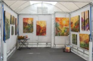
It happens wherever I go. Indoor shows, outdoor shows, or in my studio (which is open to the public), individuals or couples come in with numbers floating around in their heads. The size of the wall, the size of the piece they are replacing, the size of art they think they need. I commend those who take the time to measure before shopping for art. The size of the space is important. It is in fact the jumping off point for selecting the perfect piece.
 Many things go into finding the perfect piece for the spot; heart response to a painting being of course the biggie. However today I want to discuss the impact of color in a room. A little color theory: warm colors (think fire and sun: red, orange, yellow) are the strongest colors in the spectrum. It takes the least amount of yellow compared to other colors to be seen from a distance. Cool colors (think cool mountain lake: blue, green, purple) are the weakest colors in the spectrum. Purple is the weakest; it takes a bigger spot of violet to be seen across a room. Want to test this? Next time you are in a stadium look across to the other side and squint your eyes. You will see those yellow Cheeseheads before you see the Purple People Eaters.
  But I digress. What that means to you as an art collector is that it takes less red, orange, or yellow to have an impact on a space than blue, green, or purple.
Point is dimensions of the perfect piece can be determined by the impact of the painting. Color is not the only element that affects the impact of a piece of art. But for now, let’s leave it at this: a smaller painting done in a warm palette may be just the ticket, or a larger piece in a cooler palette. Now you’re on your way to becoming an expert!
Today’s paintings: Warm: ” East of Eden”, 20×20, $350 Cool: “From One to Another”, 12×12 $200
Leave a comment | tags: art, art buyers, art collecting, art lesson, art lovers, art shows, art studio, Cheeseheads, color impact, color palettes, color theory, original art, paintings, purchasing art | posted in Art Collecting, From the Easel
Are you an art snob? Several years ago a gallery owner told me that they only represented “collectible” artists that “would be in the books someday”. Since that day I have observed, pondered, and questioned others in the industry on this idea. My conclusion? Art professionals that make such claims are in fact art snobs. The dictionary defines snob as “one who affects an offensive air of superiority, as in matters of taste or intellect”. This attitude and definition of “collectible art” does more harm than good to artists and collectors alike because it pretends to define for others what is in fact “collectible”.
 The point that I want to make is that “collectible” is in the eye of the collector. What is valuable to me as a collector may not be valuable to the general public or the art industry. I know of a couple that has an art collection valued in the tens of thousands of dollars. They own some of the “big names” in the art world. Yet as you walk in their home, the first “art” you see is a mass produced print of Rembrandt’s “The Return of the Prodigal Son” framed and hung with honor. Why? Because that painting, and Henri Nouwen’s book of the same name hold significant meaning for them. They value the message behind the painting; we honor what we value. I would suggest that we should all apply that same heartfelt approach to all art purchases.
What we value we also gather around ourselves in our home and work environments. Simply put, what you value is “collectible” for you. The freedom is yours to purchase and treasure what speaks to your life. I encourage you to listen to your heart whenever you are considering an art purchase. It is the only “voice” that matters.
Listening to your inner voice will bring peace of mind and will displace any anxiety about needing to “understand art” or “make an investment”. Whenever you invest in your peace of mind, spend money on something that brings you enjoyment, or purchase art that shares your vision and voice, you are making a sound investment with years of great returns.
4 Comments | tags: art, art buyers, art collecting, art galleries, art investment, art lovers, art snobs, collectibles, collecting, Henri Nouwen, Inner voice, purchasing art, Rembrandt | posted in Art Collecting
 Recently one of my collectors shared how they got started collecting my work. He reminded me that they first purchased a small piece, took it home, hung it and began to enjoy. It was as they realized how the piece took on a life of its own in their home, that they began to consider larger work. “We saw how much more we liked it than we originally thought; that’s when we knew we wanted more of your work.”
The other day I began a smaller piece as a prototype for a larger commission. Some artists will sketch smaller versions of paintings to check composition, etc. I actually paint a smaller piece because my process doesn’t lend itself well to sketches. In the prototype I will work out the color palette, the placement of design elements, and the overall movement of the piece. In fact I can pretty much guarantee that if you commission me to paint a large painting, I will first work things out in a smaller format. In fact it is something I often share with my commission clients so that we are on the same page when it comes to their special order.
My point is that starting small works for both artists and collectors. My collector is right on the money with a great way to begin purchasing art. If you have never taken the plunge into the world of original art, a small piece is a great way to begin. If you like an artist, but can’t yet afford the large masterpiece, a small masterpiece is a great treasure. Small work can be placed on an easel and used on table tops, book shelves, counters, as well as hung on the wall. Another collector’s first purchase was one of my angels, that she looks at every morning as it sits on her bedside table.
My advice? Go ahead and start small. You may discover like my clients, that you’d like more because of what the piece does for your home, office, and your outlook on life. Or you may decide that one is enough. Either way you own an original, have brightened your life, and have helped an artist along the way. It is a first step in what could be a very exciting journey into the world of art. Good on ya!
 This little gem is called “Poppy Fields” It measures 10×8, has painted gallery wrapped edges and is perfect for that little splash of color in any room of the house. Available at the studio for $100. I also offer many pieces under $100 in a variety of sizes and shapes. You really can own an original for under $100!
Leave a comment | tags: art, art buyers, art collecting, art lovers, artist, collectibles, commissioned art, original art, paintings, purchasing art, small art | posted in Art Collecting, Being an Artist


